
Six Risks if Your Industrial Site Isn't Responsive By the End of the Year

You may wonder why your industrial site needs to be responsive. After all, don't most business people access the Internet from their desktops? Not necessarily. When you look at the general population and their smartphone patterns, you realize mobile is the wave of the future and if you aren't already focused on making your site friendly to mobile users, you should create a plan to get there by the end of the year.
By the year 2020, experts predict there will be 2.87 billion smartphone users. Around 52.7 percent access the Internet via their phones, but that number should rise as 5G becomes more prominent and more and more people buy smartphones.
Let's take a look at some of the problems if your site doesn't embrace mobile technology soon. Responsive design is simply design that adapts to the size of the user's screen, whether the orientation of images, the size of the text or ensuring features work correctly on phones. Here are six risks if you don't make your site accessible to smaller screens:
Risk # 1: Not Keeping Up with Standards
No longer is mobile an option. With some of the changes in Google's algorithms, those searching via mobile may not even see your site if it isn't optimized for their devices. Almost all businesses understand the need for mobile responsiveness, so ignoring the standard puts you behind the competition. Users expect your site to look similar no matter where they're accessing it from.

Transcendia creates custom film materials, such as protective wrappers, sanitary items for healthcare and food and beverage covers. Their website works nicely on both desktop and mobile, adapting to the smaller screen size by pushing the categories to two columns instead of four. Otherwise, the layout and look of the site appear similar on both smaller and larger screens.
Risk # 2: Creating a Poor CX
Customers pay attention to the experience they have on your website. If they access your site via mobile and it loads slowly or elements appear skewed, they may see you as unprofessional and bounce away from your site. As an industrial company, you likely serve other businesses, so they already understand the importance of a good user experience (UX) and expect no less from you.
Risk # 3: Building Too Much Separation
Can't you just create a separate mobile and desktop site? Do you really need to work on responsiveness? While you could create two sites and some companies went that way in the past, it's much easier to have a single site that responds to the user and adapts to their needs. This also allows you to create one marketing campaign and drive traffic to one location instead of two. It saves you time and effort in the long run.
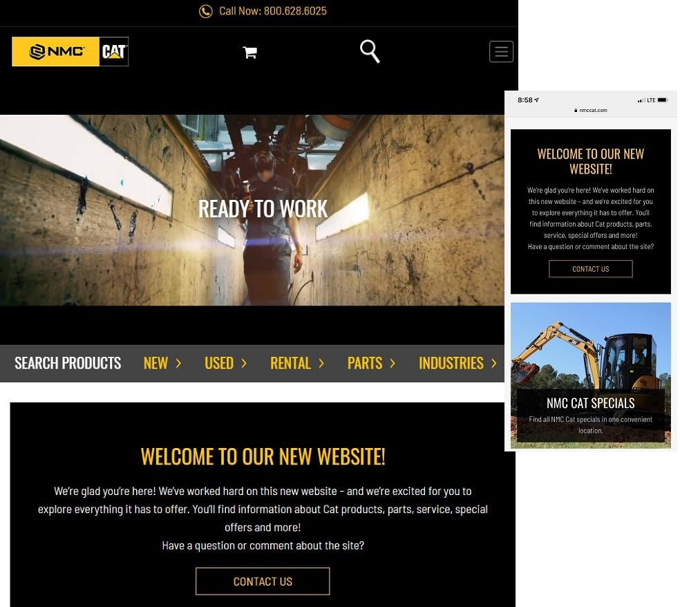
NMC CAT does a good job of creating a responsive site which adapts to the user's screen size. If you access the site via a computer, you'll notice the look is quite similar to when you access via your smartphone. The images are the same and the amount of space they take up on your screen adapts depending upon how much space you have.
Risk # 4: Losing Social Media Referrals
People spend about 69 percent of their media time on smartphones and as much as 80 percent of their social media time is via mobile devices. Since people are already on their social media when browsing your website, they are more likely to share an interesting piece of content or a link to your site. If your site isn't mobile-ready, then you lose potential referrals.
Even if the person accesses your site on their desktop and share your content, their friends may not be able to load your site properly if they are using a phone on their end. Don't risk losing this growing traffic flow to your site. Make sure it's friendly to your visitors no matter how they come to your page.
Risk #5: Missing New Technology
The devices we use today are certain to change as technology advances. Already, things such as voice search are becoming more important due to the Internet of Things (IoT) and devices such as Google Home and Alexa. Where smartphones and other inventions take us in the next year or two is anyone's guess. If your website adapts to different types of devices, though, it is much easier for you to keep up and reach users no matter what tools they use for Internet browsing.

Braud Welding has a website that adapts to different screen sizes easily. Note how the header shifts from one line to two and the image reduces in size. Everything you see on a desktop is still there, it is just condensed a bit and you do have to scroll more, but mobile users are used to scrolling and adapt easily to it.
Risk # 6: Offering Readable Text
Have you ever visited a site on mobile that you can't read because the text is either huge or tiny? This is due to the site not being responsive to different screen sizes. When you offer responsive text, your user sees a font that is clear but not too large or too small for the device they have. There's nothing worse than having to scroll both down and to the side to read text on a page and you can be certain the user will leave if that is what they see when landing on your website.
You Can't Afford Not to Go Responsive
With so many people using mobile devices, you can't afford to put up a website which doesn't adapt to the needs of the user. With a responsive site, you'll reach all your potential leads no matter how they access your site. You'll also be prepared for any technological changes in the near future.