
Why Your Landing Page Isn't Converting — and How to Fix It

You've put hours into your web design, and your landing page seems to have everything in order. However, people are bouncing away without converting into customers. There are many possible reasons why your landing page is not working the way it should, and thankfully, there are remedies.
Around 80 percent of marketers archive their conversion rate optimization results so they can measure progress over time. If you aren't tracking this, start keeping the data today so you can see what tactics work and what needs adjusting. That way, you can avoid constantly doing something that's not working.
Small businesses don't have the budget to hire someone to figure out the in-depth statistics behind why a page isn't converting, but there are some standards for landing pages every business owner can follow. While it's impossible to give one for every webpage out there, there are some common errors that may reduce your conversions.
Mistake #1: Too Much Information
It's tempting to put all the information about your brand and why people love you on your landing page. After all, you're trying to convince users why they should trust you with their business. However, too much clutter confuses the issue and makes readers wonder what action they should take next. Instead, keep things simple and focused on the goal of the page. You can always create another one to cover secondary objectives. It's better to have multiple landing pages than too much clutter.
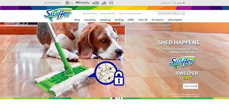
Swiffer does a good job keeping the focus on educating the public about its products. It shows off what one of its sweepers can do and then adds a "Learn More" call to action (CTA) button. It summarizes what the product does in a short description that reads "Trap and lock away dirt, dust, pet hair and allergens."
Mistake #2: Generic Writing
You must know your target audience and know them well. If your writing is too general, it won't resonate with anyone. Figure out who is in the market for what you have to offer and speak directly to them, even if it excludes others. One of the best ways of doing this is by creating a buyer persona based on website analytics — what visitors come to your site and from where — and internal data about your current customers. Create a mock person who represents your typical customer.
Mistake #3: CTA Button That Blends In
Your CTA button needs to contrast with the other elements on the page so it stands out to readers. If it blends in, the user may not realize it is an actionable button and think it's just a part of the overall design. You can do this with a pop of color or by using the same color palette, but dark on light or light on dark, depending upon what background you're utilizing at the time.

York Saw & Knife does a good job offering a CTA button with sharp contrast. When the user lands on its page, they see a gorgeous blue color palette. However, the CTA button is a brighter shade of blue and is also outlined in white so it pops off the page. The button invites the user to "Find Out More."
Mistake #4: Your Title Is Vague
The minute a user lands on your page, they should know what the purpose is. If your title is too general, then the user may become confused. For example, rather than saying "Eat Dinner" when you run a pizza restaurant, say "Eat Pizza." The more specific you can be the better. Of course, you also need to tie your title into the purpose of the page and come up with something creative and different than what your competitors might use. Instead of "Eat Pizza," you might use a headline like "Eat the Best Pizza You've Ever Tried."
Study what others have for headlines and try different versions until you find the one that converts best with your particular audience.
Mistake #5: Too Much Information
In an effort to convince readers they should do business with you, it might be tempting to share every piece of information the user could ever want about your company and product. However, this is sometimes overwhelming for a small space such as a landing page. Instead, pick out the most commonly asked questions and provide answers upfront for users. Highlight the things that make you different from your competitors. You don't need to include common knowledge items.
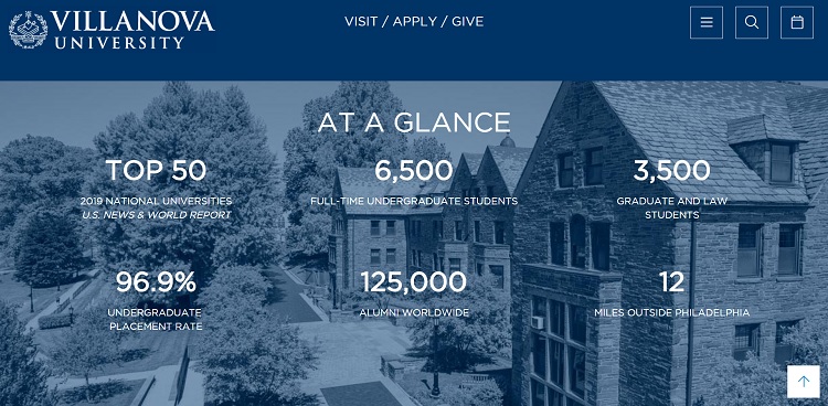
Villanova University offers site visitors a glance of some of its top features and why students should consider the school. It talks about how it is one of the top 50 universities, how many students it has, how close it is to Philadelphia and its undergraduate placement rate. These are facts that make Villanova stand out from other universities in the area.
Mistake #6: Not Using Any Images
Around 80 percent of marketers use visual assets for social media posts, but you should also utilize them on your landing pages. Users process images faster than text, so adding a relevant picture to your landing page reinforces the message you're trying to get across. They shouldn't be generic stock photos, though. Show your product being used by someone or highlight the item itself in 360 degrees. Images help create a powerful representation of your brand, so choose them wisely.
Test Your Pages
Once you make changes to your landing pages to improve conversions, perform some A/B testing and see if they're converting well with your audience. A successful landing page isn't created overnight. You'll need to make tweaks from time to time as your audience changes, or as the internet itself and the way people search and browse online evolves. Pay attention to what works well and what doesn't, and you'll be able to take drab landing page results to fabulous conversions.